Visitor Management System
A web platform for secure, real-time visitor tracking across multi-tenant government and corporate facilities.
- Role
- Lead Product Designer, GX Informatics
- Client
- GX Informatics
- Industry
- GovTech · Facility security
- Year
- 2025
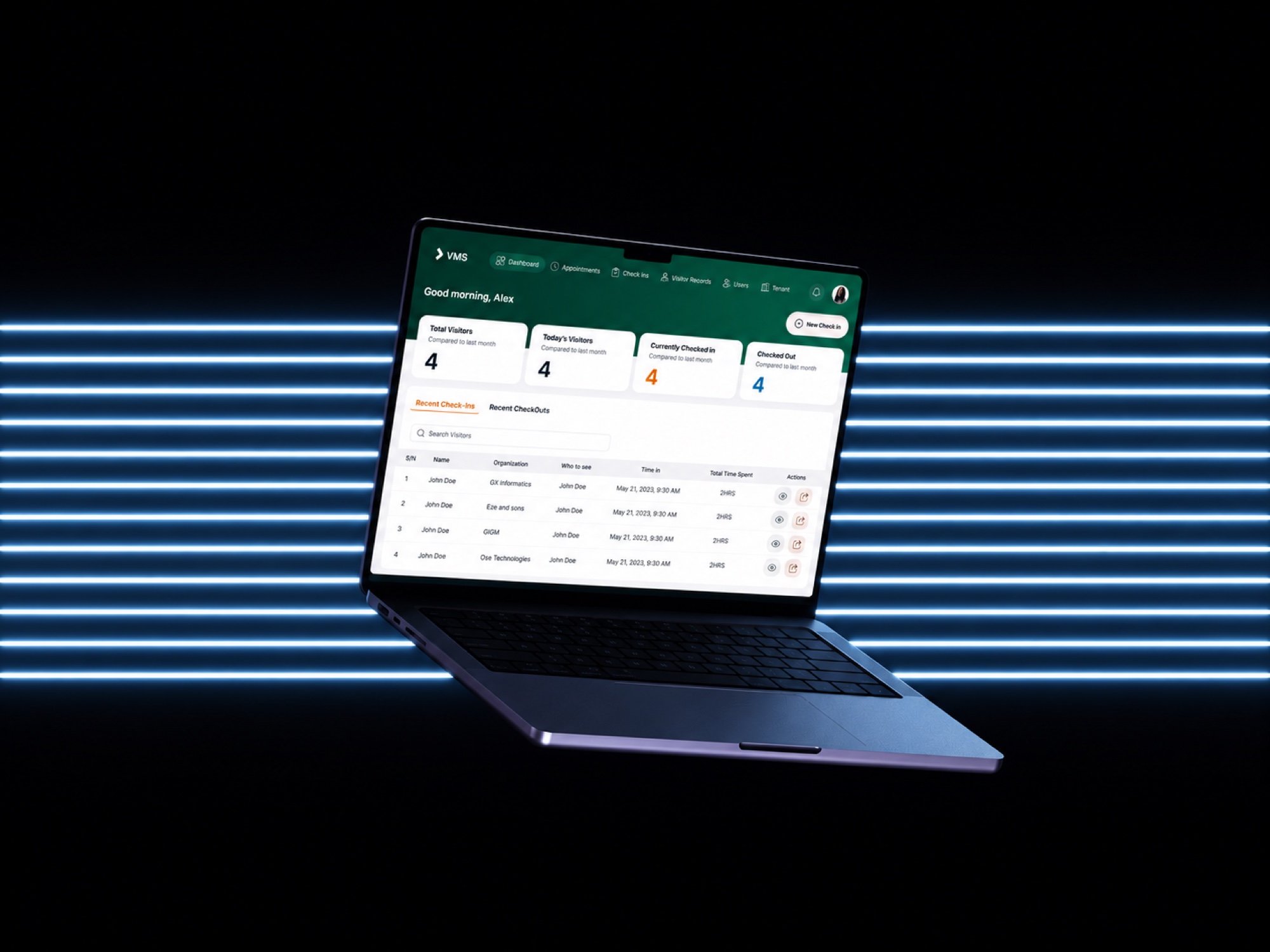
Project overview
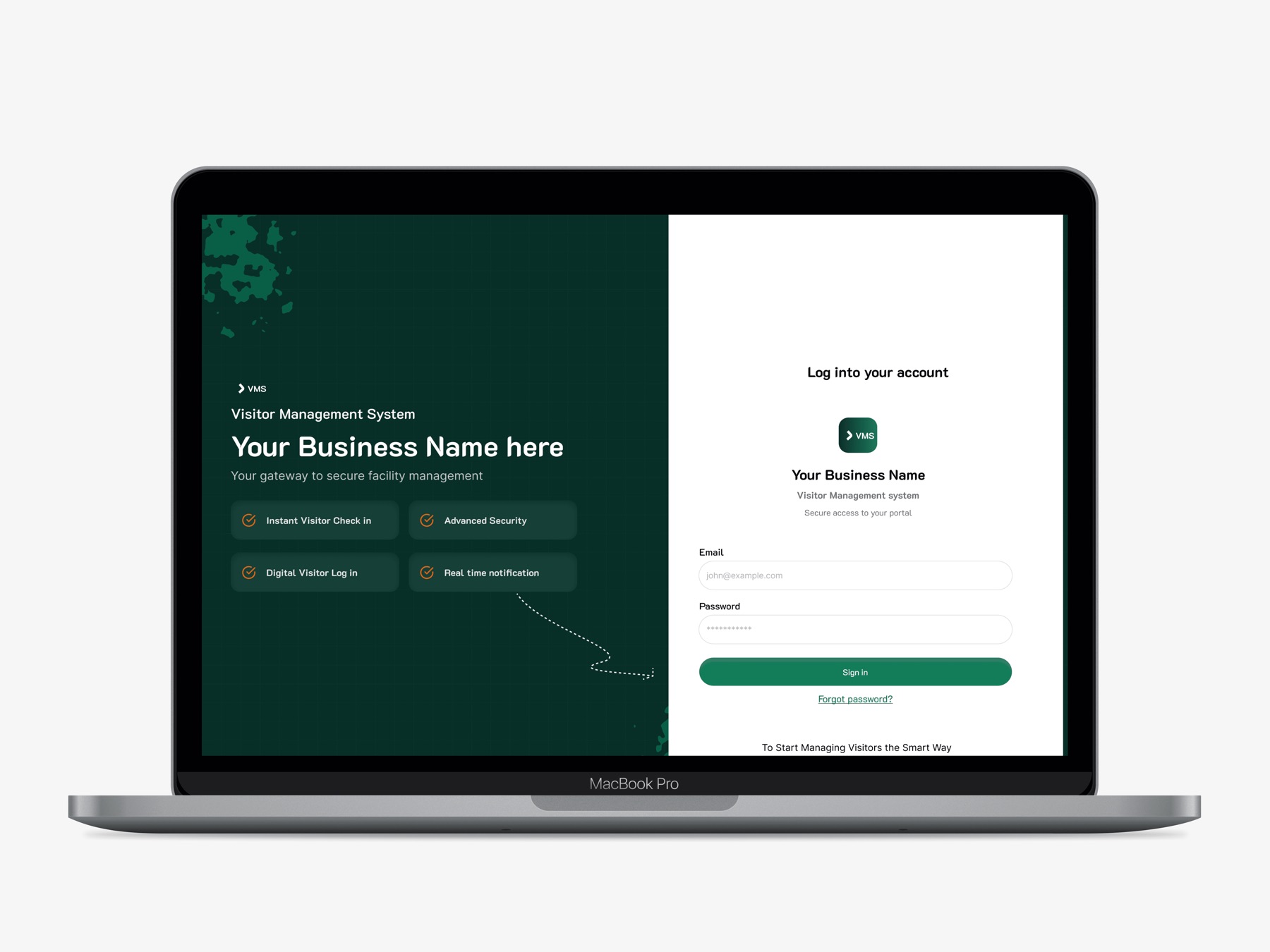
The Visitor Management System (VMS) is a web platform for facilities to track, manage and audit visitor access, from pre-scheduled appointments through check-in, check-out and historical reporting.
It's designed for security officers, front-desk administrators and facility managers in multi-tenant buildings, government offices and enterprise campuses, and replaces paper logbooks and scattered spreadsheets.
Context & problem
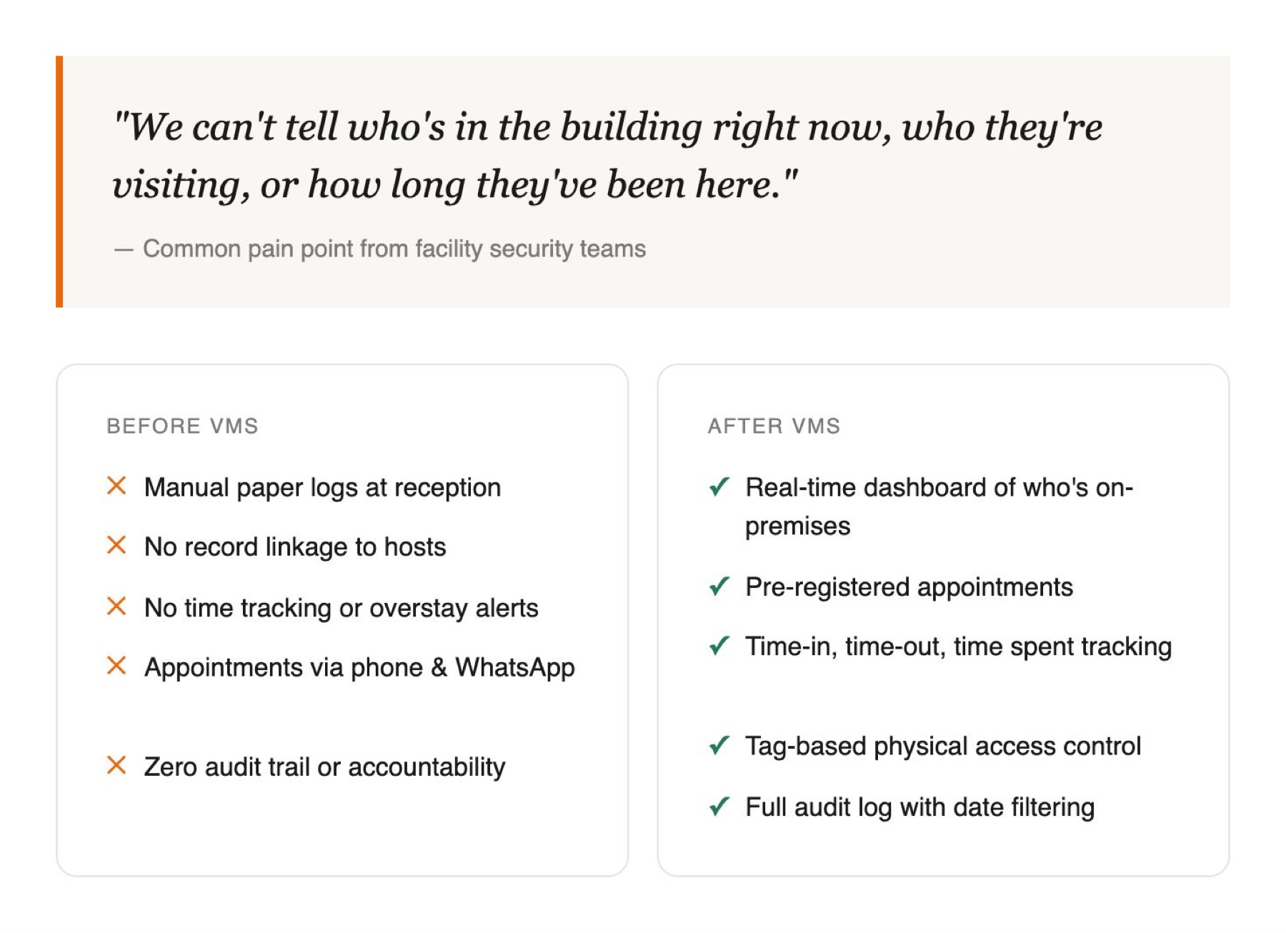
“We can't tell who's in the building right now, who they're visiting, or how long they've been here.”
Common pain point from facility security teams
Most facilities in Nigeria's government and corporate sector still rely on paper visitor logs: illegible entries, no audit trail, no way to know who is on the premises, and no accountability when something goes wrong. Appointments were coordinated over phone calls and WhatsApp.
Who it serves
Security officers
Checking people in while paying attention to everything else around them.
Front-desk administrators
Managing appointments and visitor records.
Facility managers
Need a live view of who is on site.
Project goals
- Know who is on the premises at any moment.
- Create a trustworthy audit trail.
- Make check-in fast enough for a busy gate.
- Prevent cross-tenant mistakes in shared buildings.
Research & discovery
Designing for the front desk as it really works.
The starting point was how visitors were already handled: paper logbooks at reception, no link to the person being visited, no time tracking, and appointments arranged over phone calls and WhatsApp.
Designing for security officers meant designing for split attention. They check people in while watching the door, answering questions and tracking who is still on site, so every screen had to work without their full focus.
Who is in the building right now?
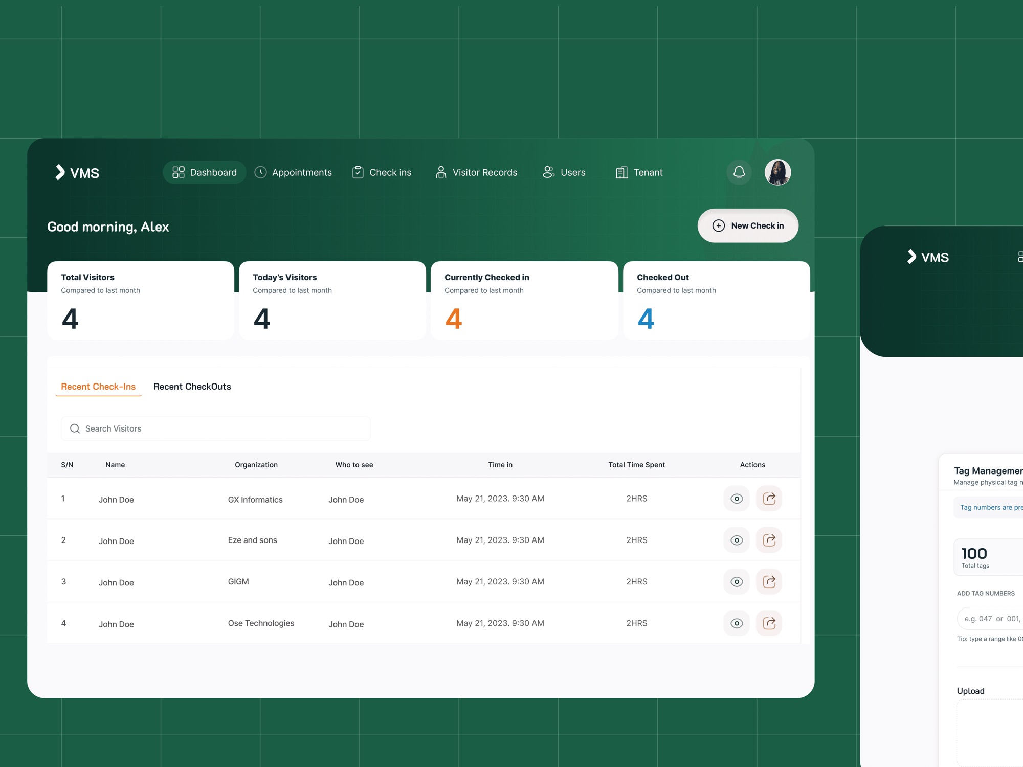
Became the dashboard's four live counts: total, today, currently checked in, checked out.
When did they actually arrive?
Became an automatic, uneditable check-in time.
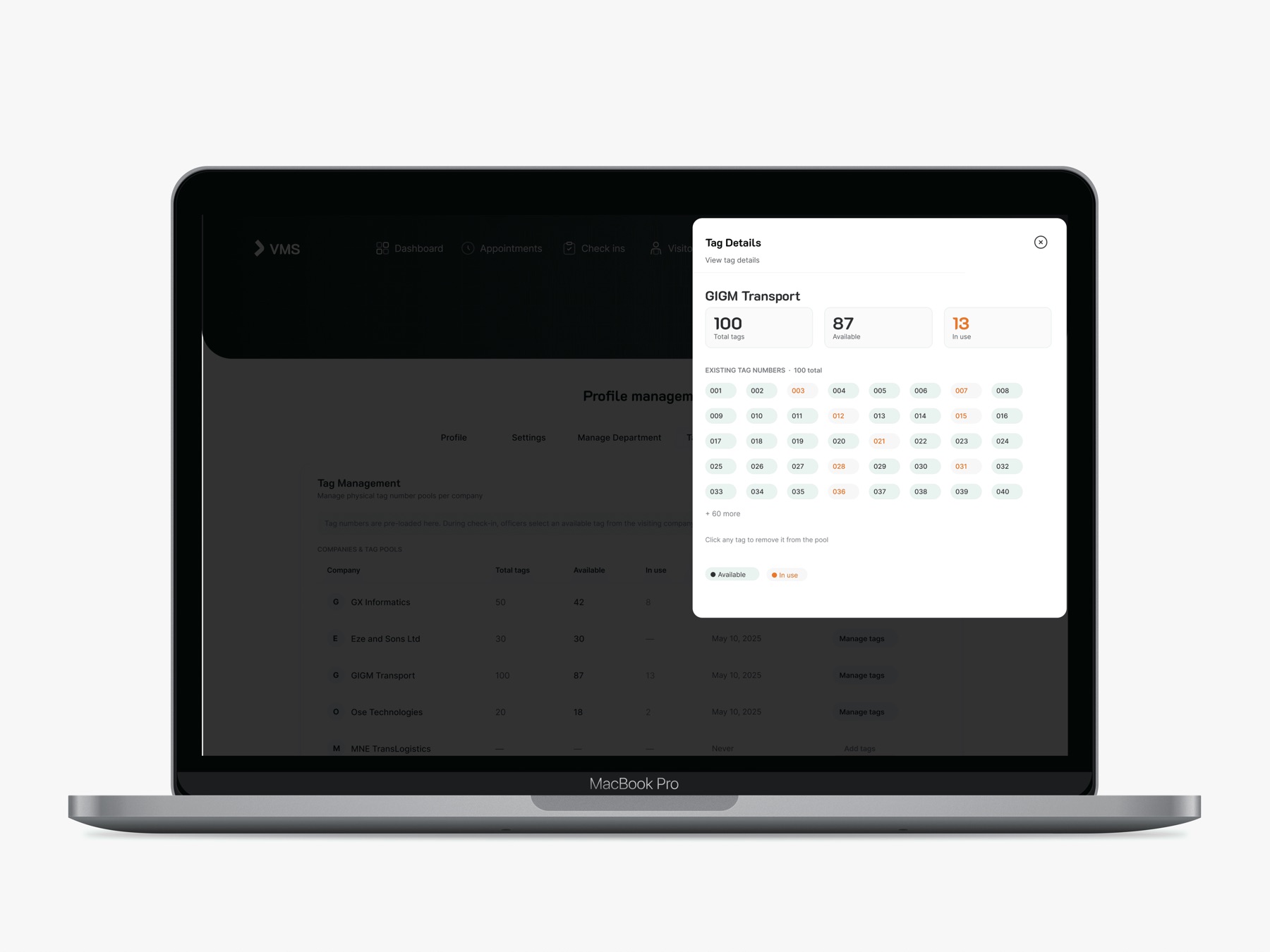
Which badge belongs to which tenant?
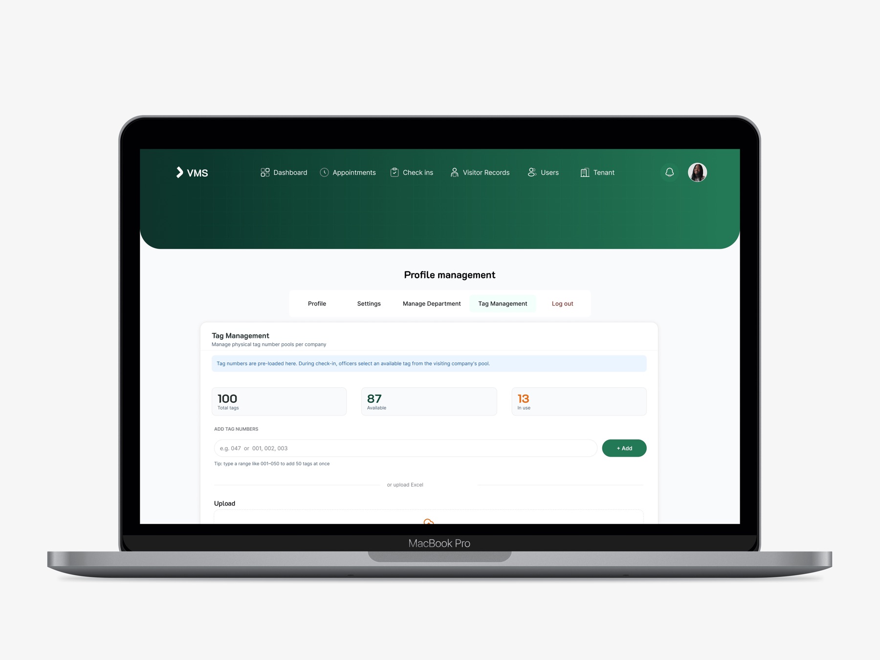
Became tag management, added mid-project after feedback from the security team.
Constraints
Officers work with split attention. Physical tags are shared across tenants. Times must be trustworthy for audits.
Product decisions
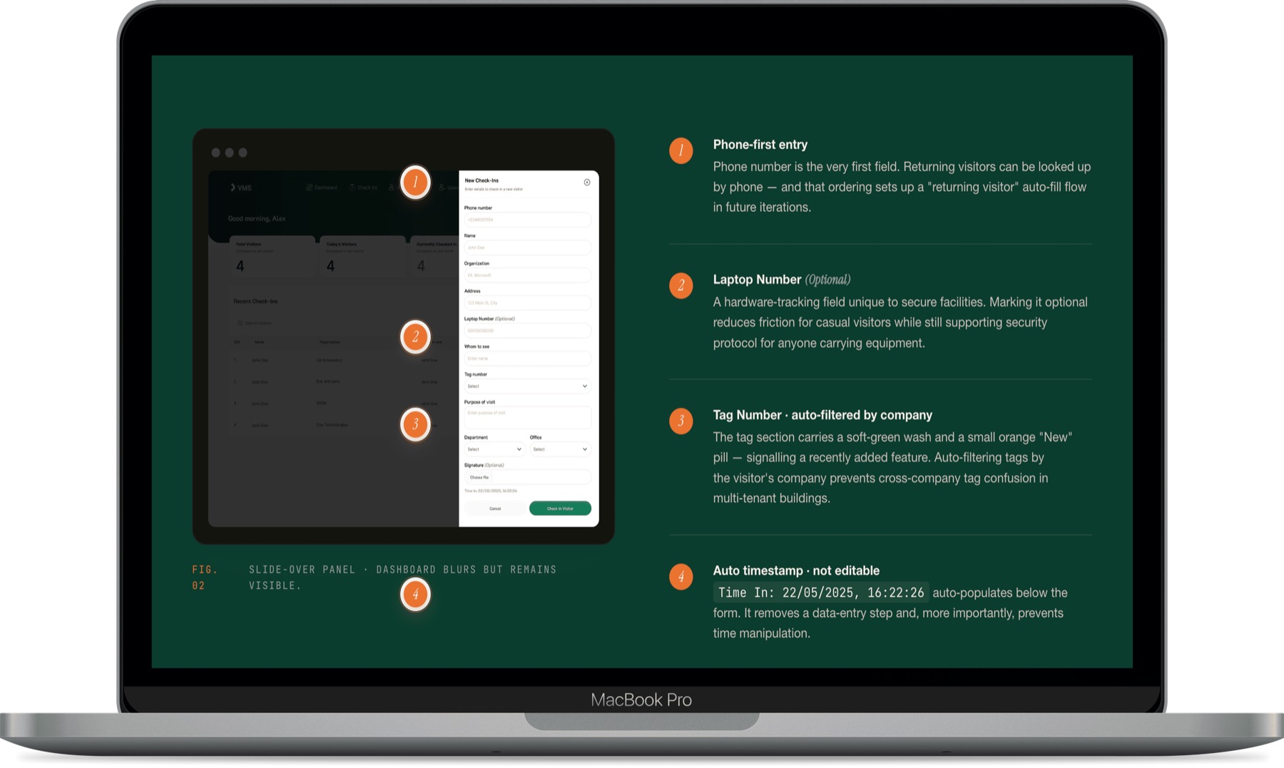
Slide-over forms
The check-in drawer keeps the dashboard visible, so the occupancy count is always in view.
Colour-coded numbers, no charts
Orange for currently active, blue for completed, ink for totals. The numbers are the data.
Auto-timestamped check-in
Removes backdating risk and fatigue errors. Shown, but not editable.
Four appointment states
Pending, Honoured, Cancelled, Completed. Two states would collapse an important operational signal.
Tags filtered by company
Prevents cross-tenant tag allocation while hiding the logic from the officer.
Information architecture & workflows
- Step 01Dashboard
- Step 02Check-ins
- Step 03Appointments
- Step 04Visitor records
- Step 05Users
- Step 06Tenants
Exploration & iterations
Choosing between options, and where I'd go next.
Slide-over panel instead of a separate check-in page
The form opens over the dashboard rather than replacing it.
WhyOfficers keep the occupancy count in view while processing a new arrival.
Four appointment states instead of two
Pending, Honoured, Cancelled and Completed.
WhyCollapsing them to two would lose an operational signal that audits and analytics need.
Numbers instead of charts
Colour-coded stat cards: orange for active, blue for completed, ink for totals.
WhyFast decisions need no extra interpretation.
Tags filtered by company
The tag field only shows badges for the visitor's tenant.
WhyPrevents cross-tenant mistakes without exposing the logic to the officer.
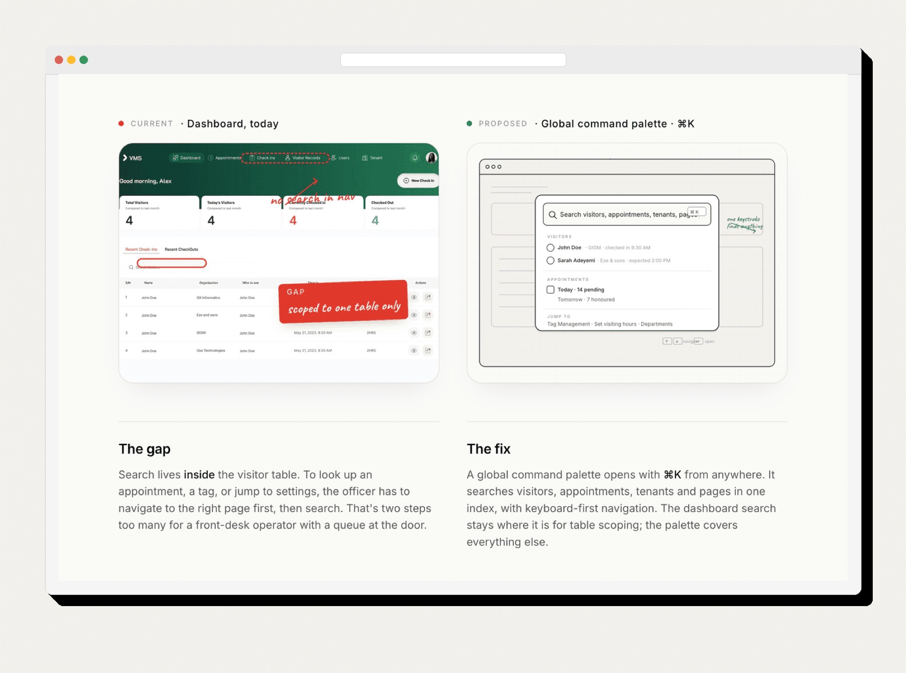
Next I'd explore a tablet view for officers at the gate, one global search across sections, and a self-service pre-registration flow so visitors can book before they arrive.
Final solution
Collaboration & implementation
Handed off to development with annotated specs and component documentation.
Results & evidence
- 64 screens designed across 6 core flows.
- A full design system: colour, type, components, spacing.
- Tag management added mid-project from security-team feedback.
- Replaced a paper-based process that had no accountability trail.
Lessons & reflections
Design for the real operating context
The slide-over panel is the strongest choice in the product because it accepts that many things demand an officer's attention at once.
What I'd push further
A tablet gate view, global search, and a self-service pre-registration flow.