Vikon
Making the job search feel less overwhelming.
A more organised way for job seekers to manage applications, track progress and stay on top of opportunities.
Concept project, not a shipped product
- Type
- Concept project
- Role
- Product Designer
- Platform
- Mobile (iOS)
- Scope
- UX & UI design, user flows, interaction design
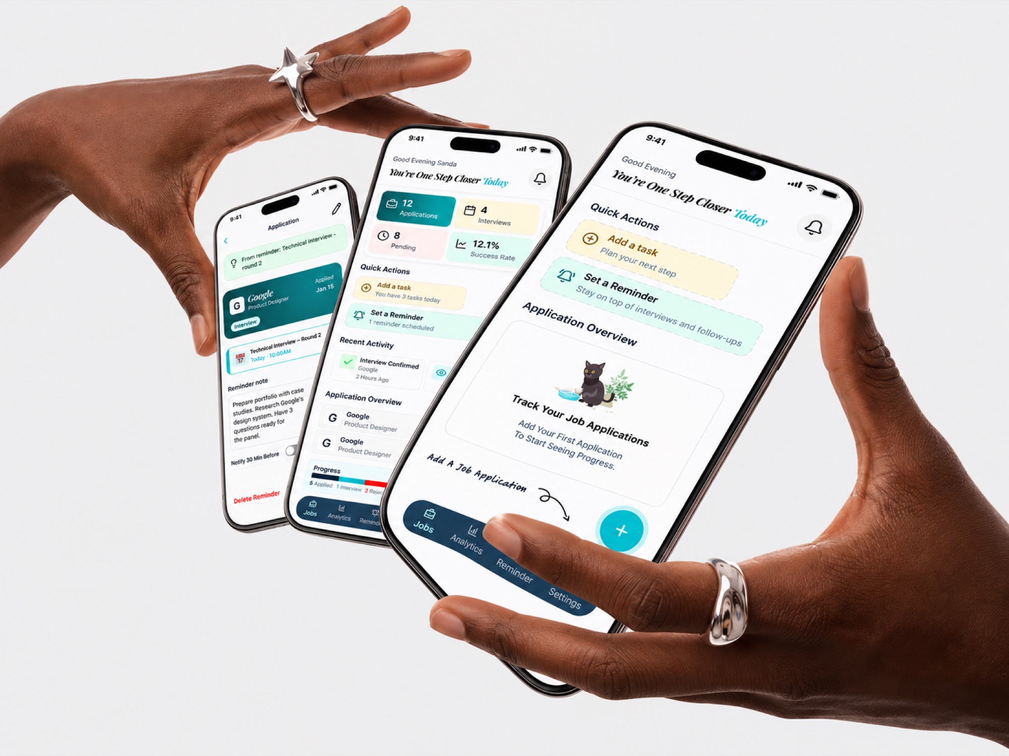
The context
Searching for a job is demanding. Keeping track of everything after you apply makes it harder.
You apply to several companies, save job descriptions, prepare for interviews, juggle versions of your résumé and try to remember when to follow up. Before long, it's scattered across emails, notes, spreadsheets and browser tabs.
Vikon explores how a mobile product could give job seekers one place to organise their applications and understand their progress.
The problem
Applying for jobs isn't always the hardest part. Keeping track of everything can be.
Without a structured system, it's hard to:
- Remember where and when you applied.
- Track application and interview stages.
- Keep the right documents with each opportunity.
- Compare roles before making decisions.
- Remember important follow-ups.
- See whether your job search is moving forward.
The design challenge
The experience had to balance enough structure to manage many opportunities with enough simplicity that people keep using it.
How might we help job seekers stay organised, make informed decisions and keep sight of their job search, without adding unnecessary complexity?
Designing the experience
Five parts of one connected experience.
Easy to get started
Onboarding focuses on the core value, organising applications and remembering what matters, with paths for guest users and empty states.
Applications in one place
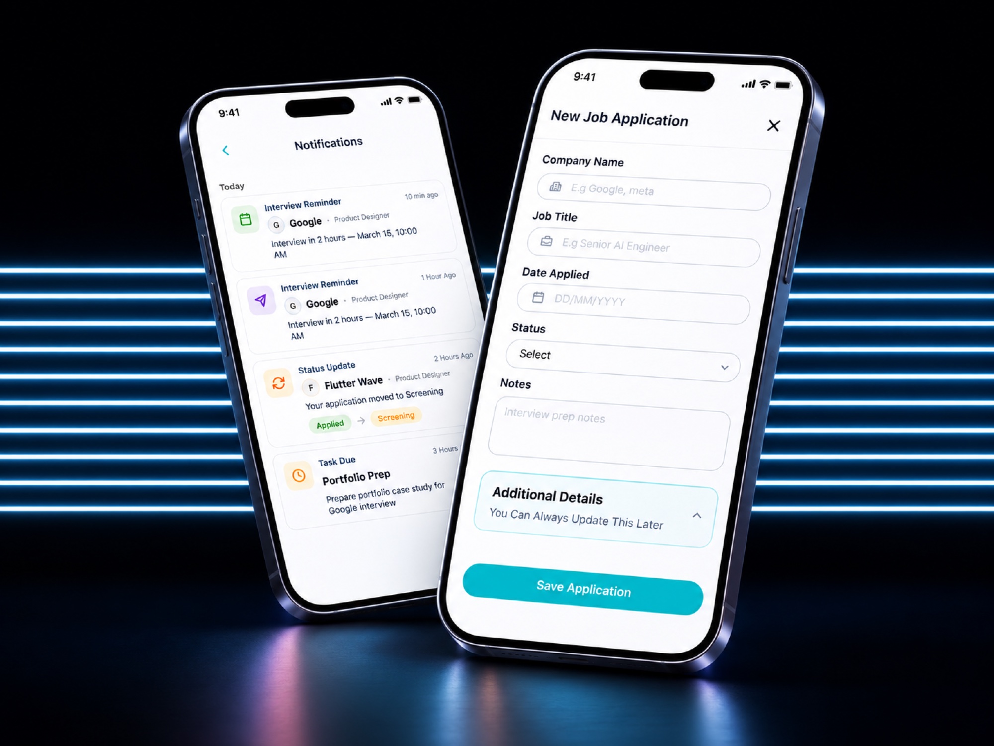
A dashboard to add applications, update statuses, filter, review details and manage documents.
Compare opportunities
Review roles side by side to decide which deserves your attention.
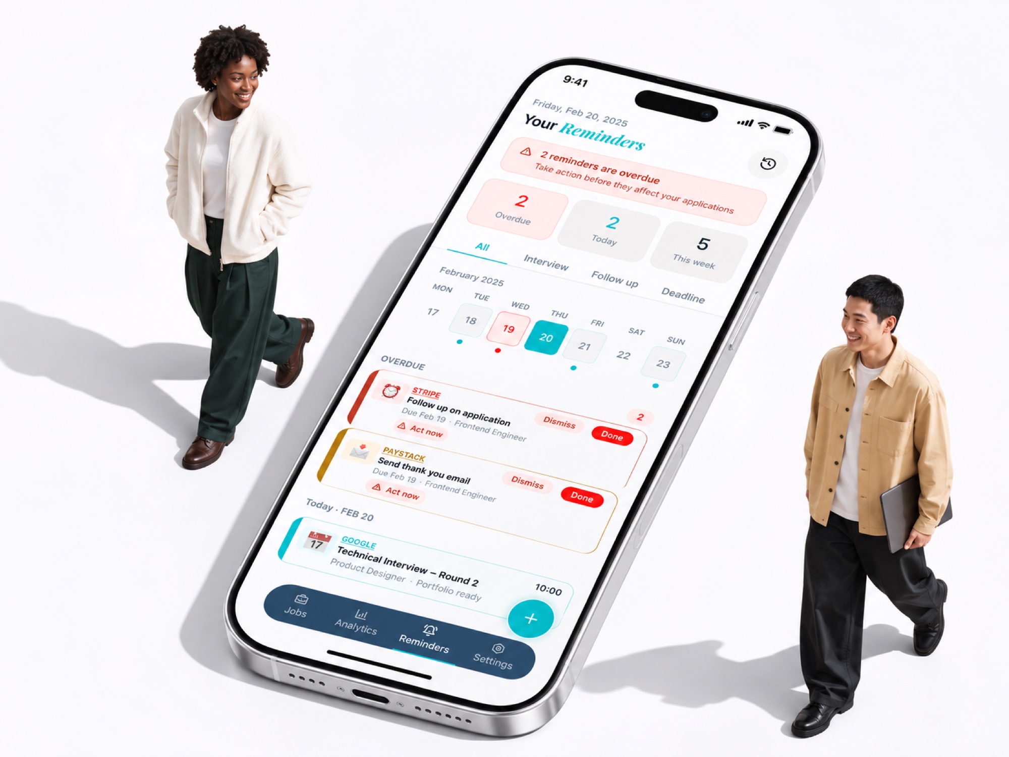
Follow-ups you won't forget
Create and edit tasks, set reminders, see notifications and review reminder history.
Progress you can see
Monthly application goals, with views of current and previous periods, so effort is visible even before an offer arrives.
Design decisions
Progressive onboarding
Show the main value before advanced features.
Centralised application records
Details, statuses and documents stay attached to each application.
Contextual actions
Editing, status updates and documents sit next to the information they affect.
Visible system states
First-time users, empty results, filter mismatches and returning users are all designed for.
Actionable reminders
Job search activities become tasks people can revisit and manage.
Progress beyond outcomes
Personal goals, without treating application volume as the only measure of success.
The outcome
One coherent system for the major parts of a job search.
- Application organisation and status tracking.
- Opportunity comparisons.
- Application document management.
- Interview and follow-up reminders.
- Monthly goals and progress.
The intended impact is less admin and more clarity for job seekers.
Time saved, engagement or application outcomes would need to be validated through usability testing and usage data.
Reflection
Job searching comes with uncertainty. People don't know when an employer will reply, how long a process will take, or whether an opportunity will work out. A product can't remove that.
But it can give people more control over the parts they can manage.
Make the work of searching for a job easier to organise, so people can focus on the opportunities themselves.